Food Bank Extravaganza
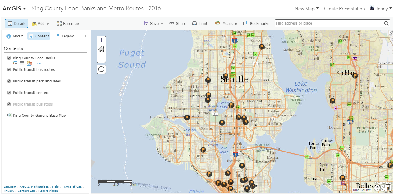
In this week's visualization exercise, I learned to use ArcGIS - a free mapping tool that allows you to build some pretty slick visualizations. With a little searching and a lot of data cleanup, I built a map of Seattle/King County area food banks and their proximity to transit lines. The map is interactive on the desktop and on mobile - click a route and it will tell you the route number. Click a food bank and it will list the hours, requirements, and communities served (along with more information).
I was shocked to learn that most of the food banks in this area don't really communicate with one another - so shared infrastructure like this is generally unavailable. This map will be out of date in a matter of months when metro routes change, unfortunately. But for now I can look at it as a pilot deliverable I'd share with some of my University Food Bank friends to show them what's possible!
